Introduction
When users log in to Blackboard Learn on a mobile device or 'low' resolution screen, screen elements such as the module menu may 'compress' or become hidden.
Table of contents
Responsive course menu
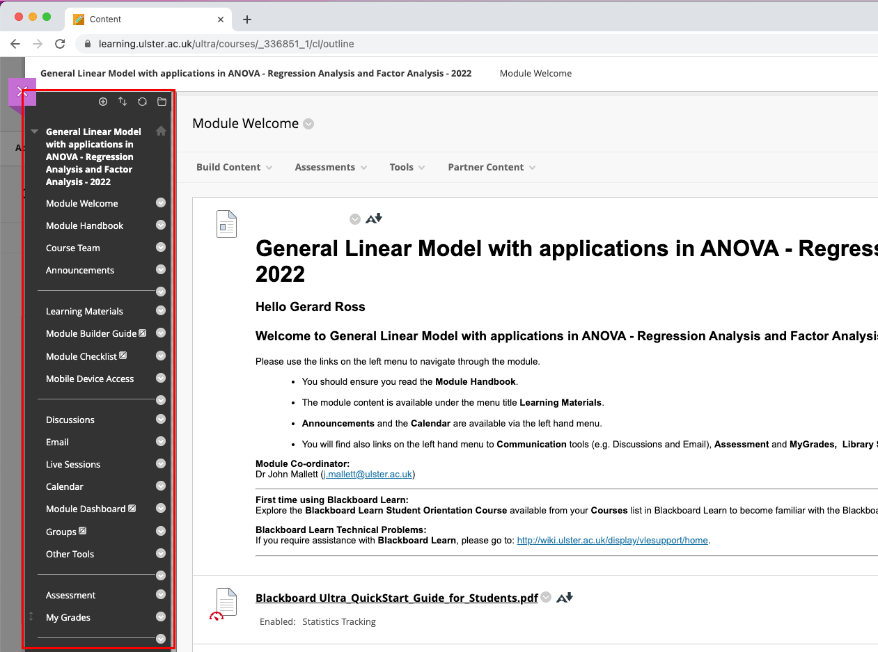
By default, the left-hand module menu will visible as shown below (the left-hand course menu is highlighted in red):
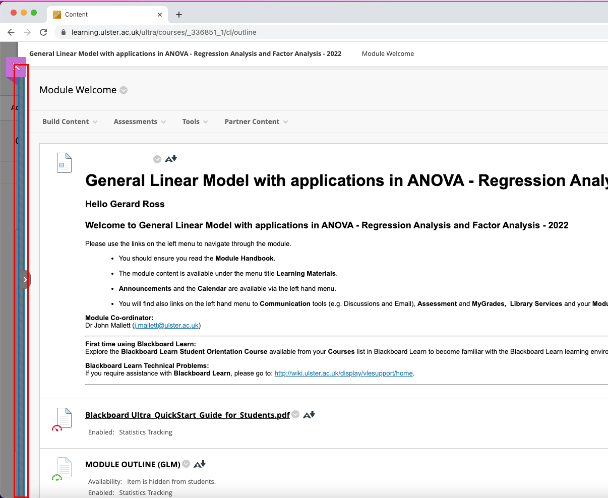
In its responsive form, i.e. when a Blackboard Learn module is viewed on a low-resolution screen or mobile device, the left-hand course menu will collapse and be hidden from users, replaced by a blue Show Course Menu bar (again, highlighted in red below).
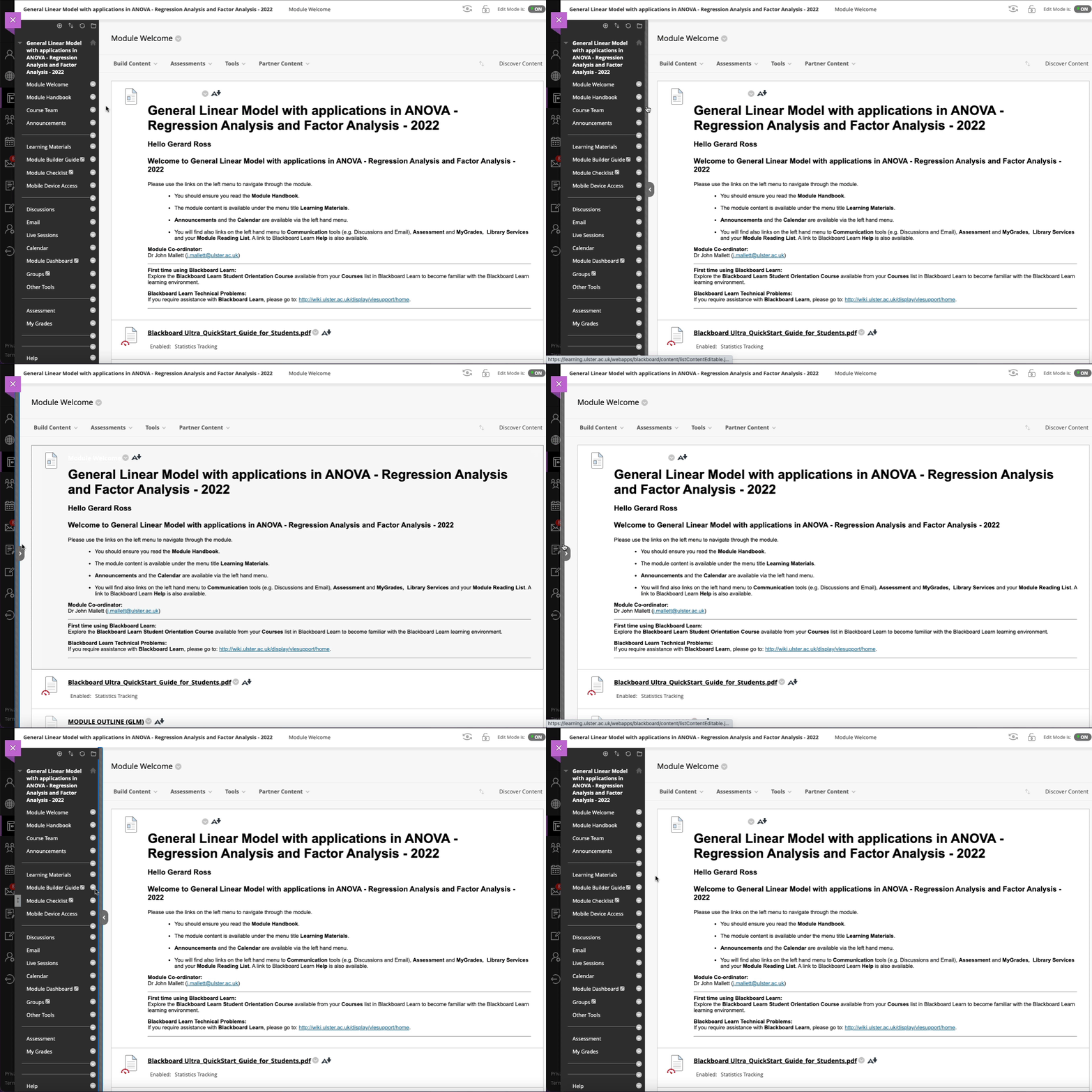
Selecting - or tapping - on this blue Show Course Menu bar will expand the left-hand course menu and make it visible again.
Tip: By tapping on or selecting this area with the mouse, the course menu can be toggled back and forth from hidden to visible.
Please Note: The above screenshots were created while in enrolled in a module as an instructor. Students and staff may not see the Build Content, Assessments, Tools and other tabs shown. However, the process of hiding and show the course menu remains the same.


